E-commerce
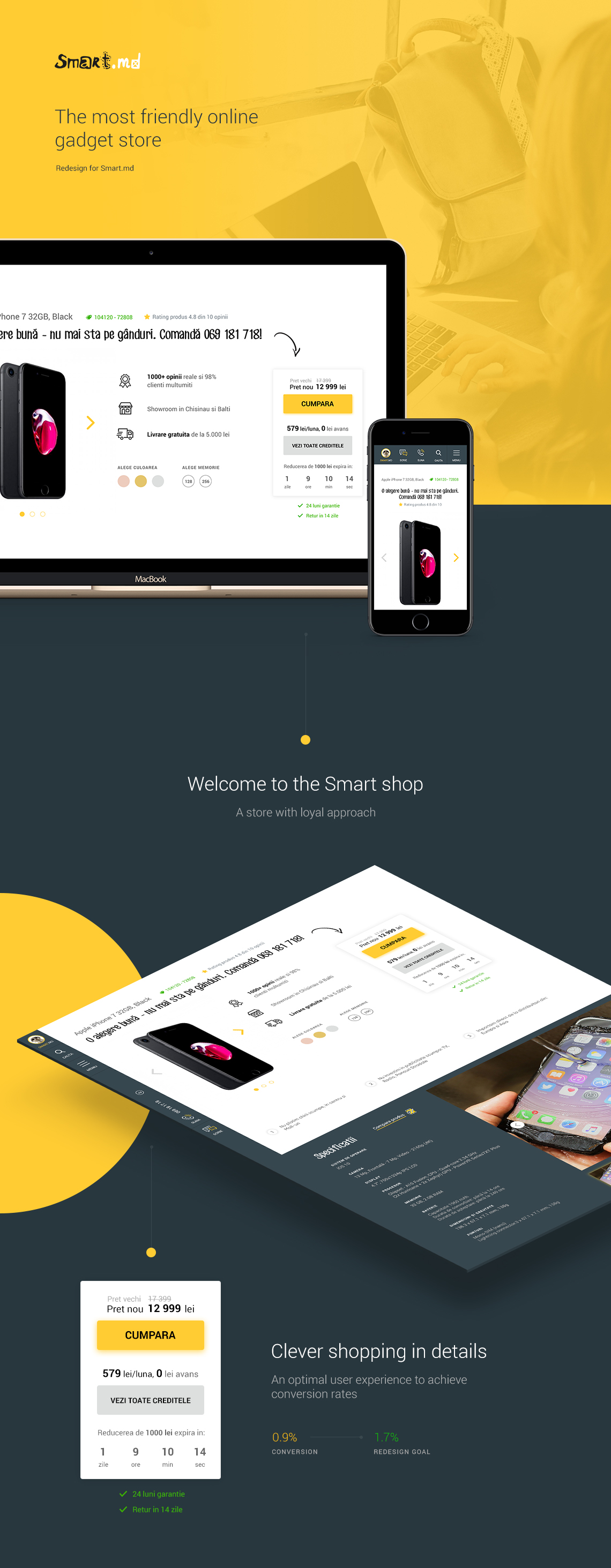
Redesign for Smart.md - the most loyal online gadget store in Moldova.

Task
Smart redesign
The redesign task was to increase the overall sales conversion on the site. At the time of launching there was about 45 000 visitors per month, 71% were users of smartphones. The total conversion for sale was less than 1%.
Smart.md is distinguished by a special approach to the loyalty of its customers, and a young audience from 16 to 28 years old. Due to the built-in marketing plan and expenses optimization of rent and premises, Smart.md provides low prices and probably the most friendly approach to its customers.

The ecommerce platform is the main selling point for Smart, so it was important to create an optimal user experience and achieve conversion rates increase from 1% to 1.7-2%.
Research
Design with data in mind
Working with Smart.md required an analytical approach to the design interface. Before starting pointlessly move pixels, we looked at the user behavior on each of the blocks. Due to a large number of visitors, 45,000 per month and qualified feedback, we identified problematic parts of the site that reduced conversion.
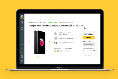
We rethought the entire layout, and paid special importance the conscious distribution of the user attention. We rebuild important components as: the product card, purchase on credit, navigation, advantages. Due to small improvements, we achieved higher involvement on the site, which was reflected in the overall conversion increase.
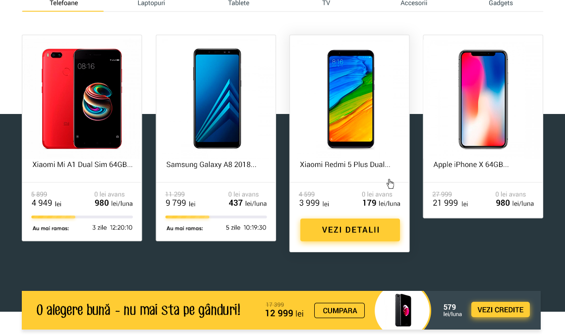
Concept
A strong marketing concept
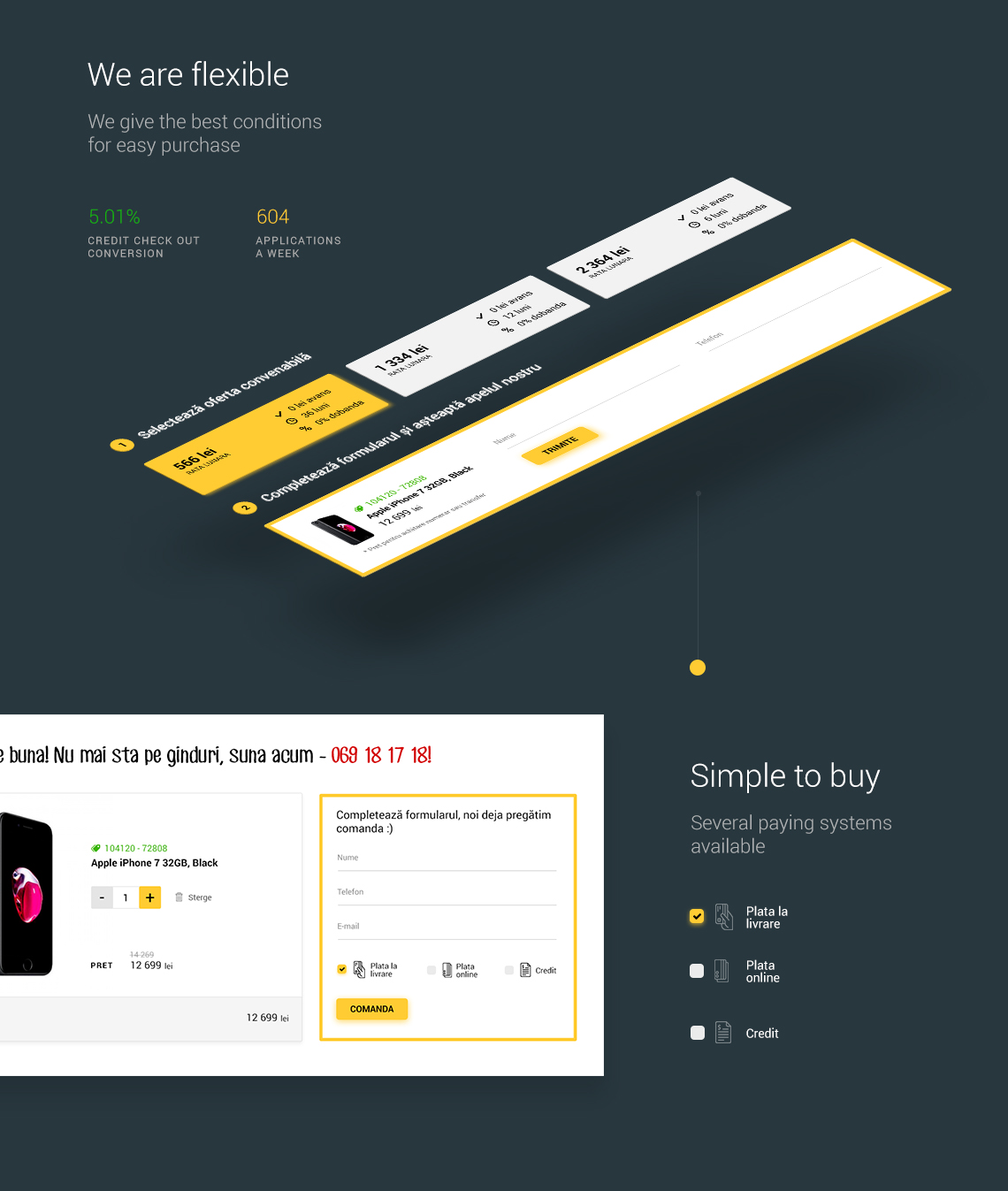
We completely rethought the product and check out page, which the main stream of applications is going. It was important to simplify and accentuate the capture forms, offering an easy first step.
We do not want to compete with goods, with other companies that sell the same equipment. Our feature is brand loyalty, we give the best conditions for easy purchase, we are flexible and care how customers are feeling before and after buying.
Team
A loyal and Smart brand
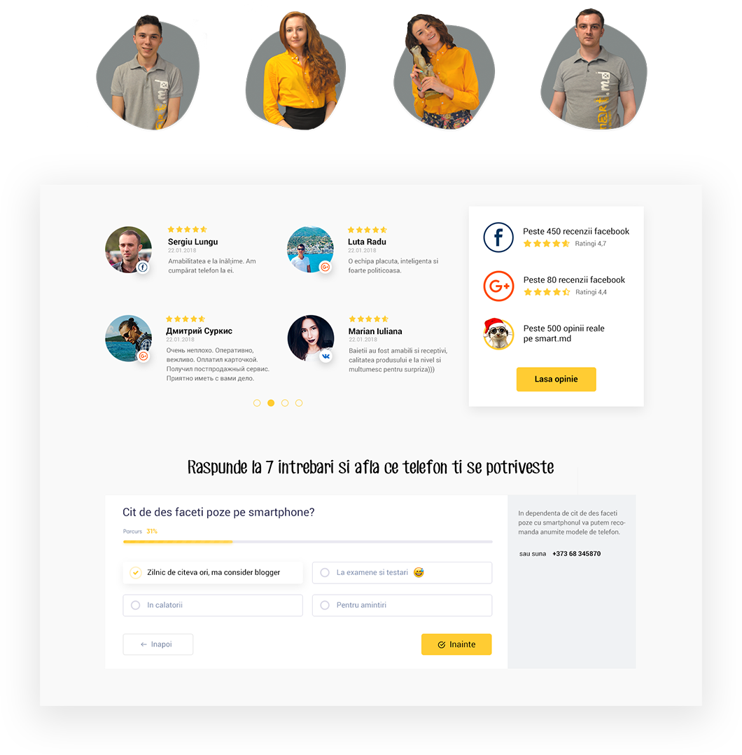
Smart.md is a pretty fun team of youngsters who love gadgets and technological progress. The only ones in the country witch collect feedback after each purchase with convenient terms of technical assistance and return. I designed a block with feedbacks that reflects the team's friendliness and shows trusting relationship with сustomers.
Navigation
Expanded Navigation
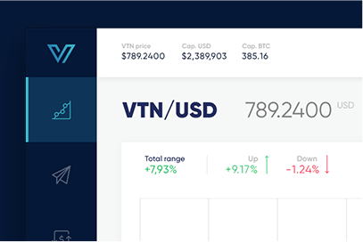
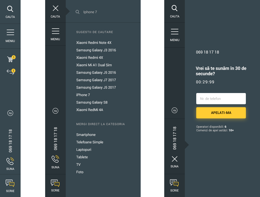
We made a bold and slightly risky decision. A fixed navigation from the left side of the screen. Aimed to expand the functionality and make it user-friendly, it look like a dashboard now :)
Selected works
I enjoy creating products from concept to release and optimize existing ones so they perform better from both a user and business perspective. My expertise covers the entire digital product design process including brand communication, user experience and user interface design.
For any questions, work or partnership, please feel free to get in touch: work@cojocarumaxim.com
