E-commerce
E-commerce site design for the leading retail point of sales systems manufacturer in Russia

Goal
Sell comprehensive solutions
The goal was to design the e-commerce site specialized on selling retail points of sales system for the leading electronic retail manufacturer in Russia “STRIH-M”. In accordance with the recently introduced law 54-ФЗ, the second important moment was to explain in a simple form the advantages of using online POS systems, which will soon replace the old cash register equipment.

The site design сomplies with a comprehensive detailed marketing research “STRIH-M” did on it’s huge audience, that counts 54% of the russian market.

Marketing
Marketing concept
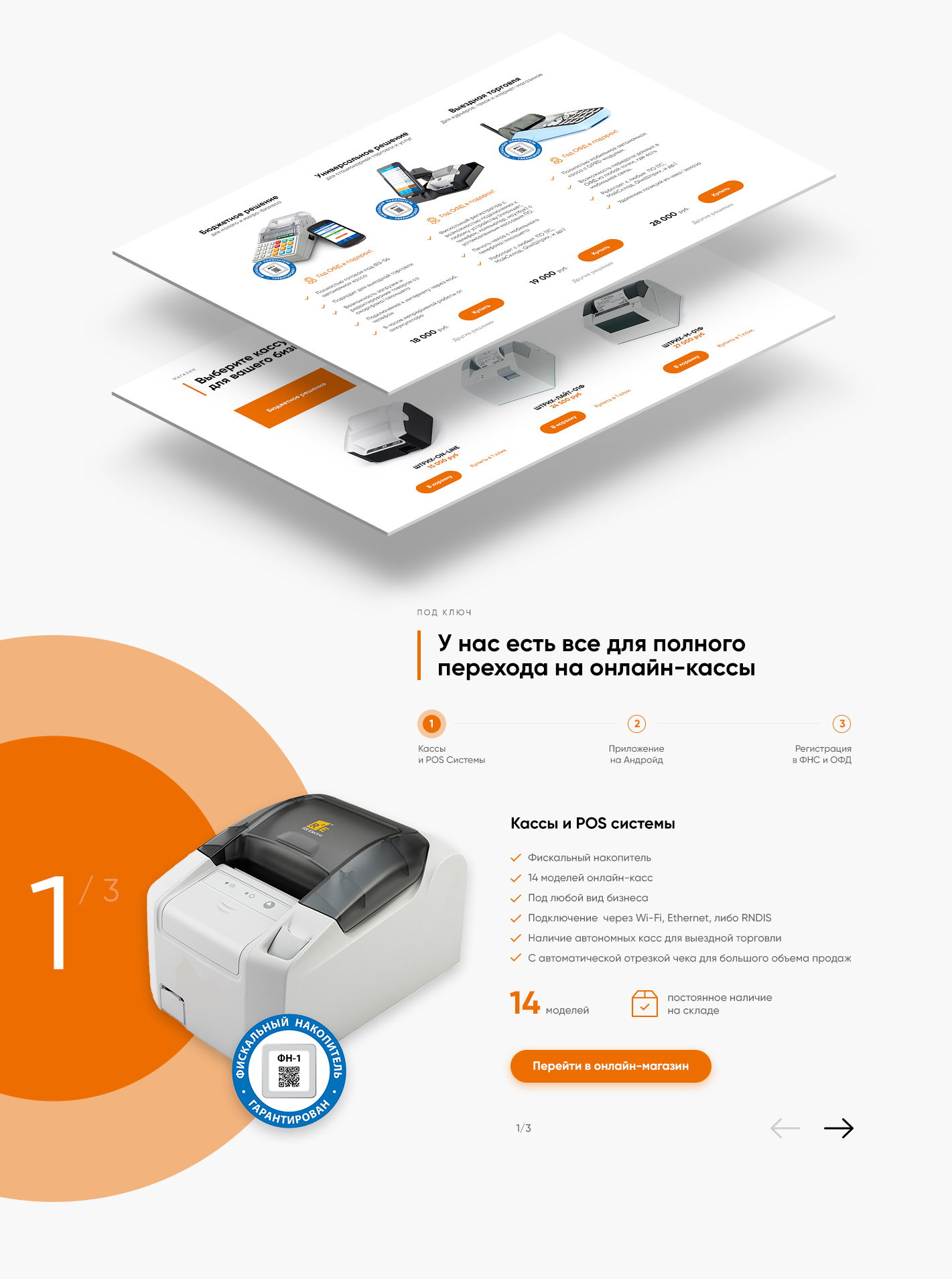
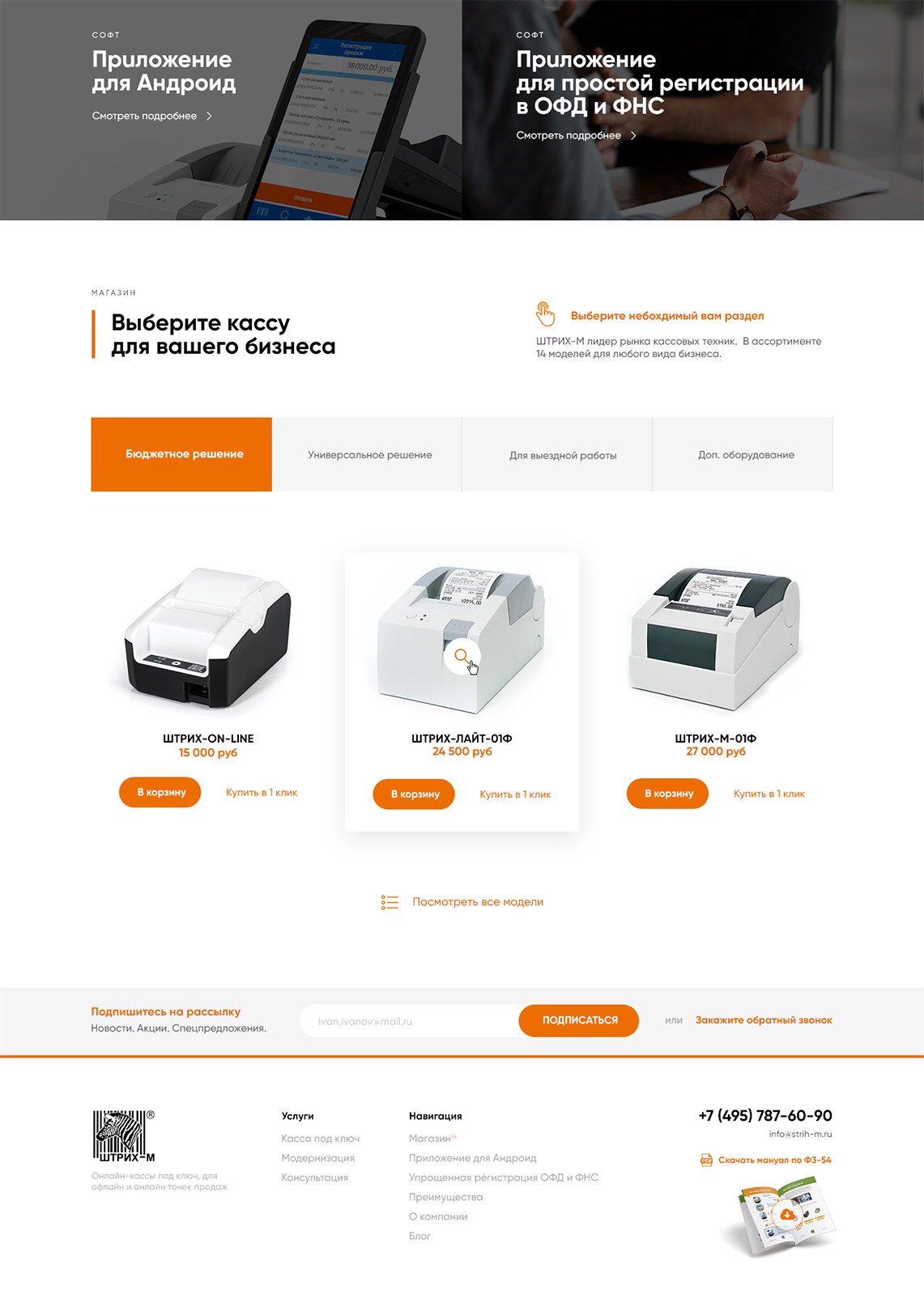
The audience is sorted in 3 main categories.
1. Those who need a cheap and fast solution implementing a POS system for their small business.
2. Cashiers for online-shops and dynamic points of sales.
3. POS systems for franchises or multiple outlets
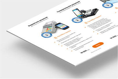
The described auditory has its own portrait with needs and doubts. Each of them, has an optimal prepared solution that fulfill its requirements. The site is aimed to satisfy specifically the targeted group. I’ve design a tab panel on the shopping page that gives easily access for the specified category.
The Law
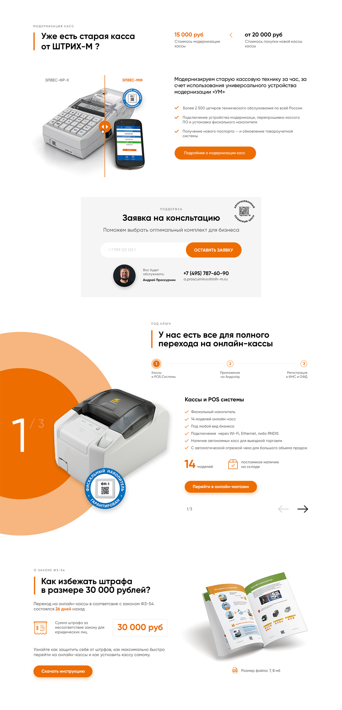
Explain the “54-ФЗ” law
I’ve designed several content blocks intended to help entrepreneurs get familiar with the “54-ФЗ” law implementation. First is a comparison slider that shows the difference among an old cashier and a renewed POS system form “STRIH-M”, and all the advantages one gets updating his point of sale.
The second block is a free instruction that prevent entrepreneurs from paying unnecessary fees, and quickly implement the “54-ФЗ” law. The instruction is available for download in .pdf format, and serves as an additional call to action form.
Conversion
Increasing conversion rate
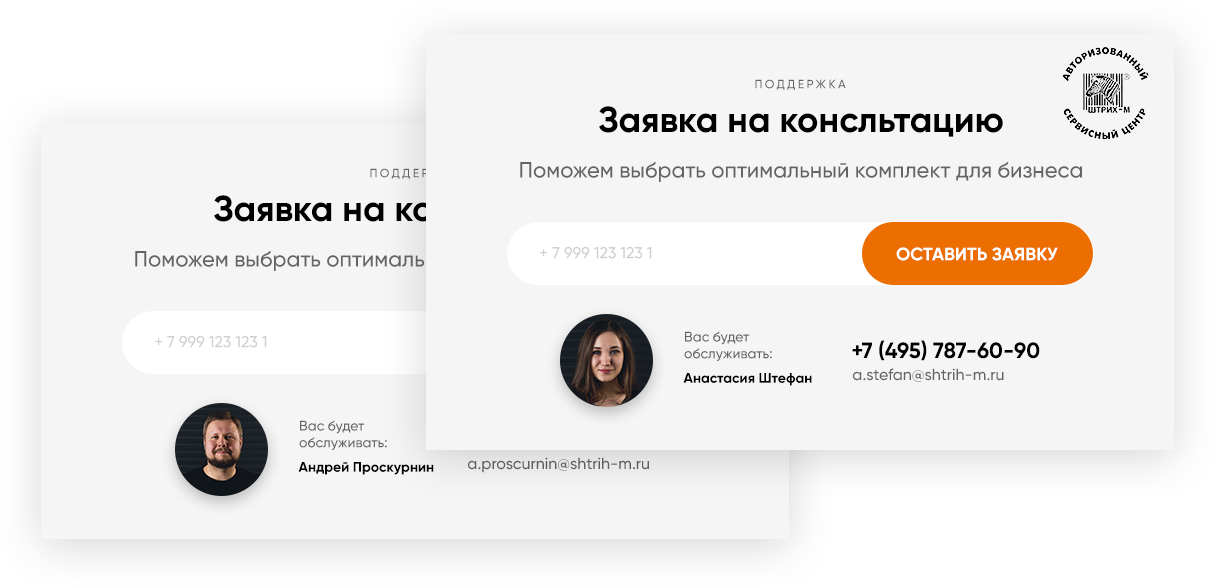
The site is divided with several call to action blocks aimed to help users get a quote on the topic. This is the case when quantity goes into quality. “STRIH-M” provides a large support department for this purpose. According the analytics, this increased the number of sales and the average conversion rate.
Features
Pop-up features
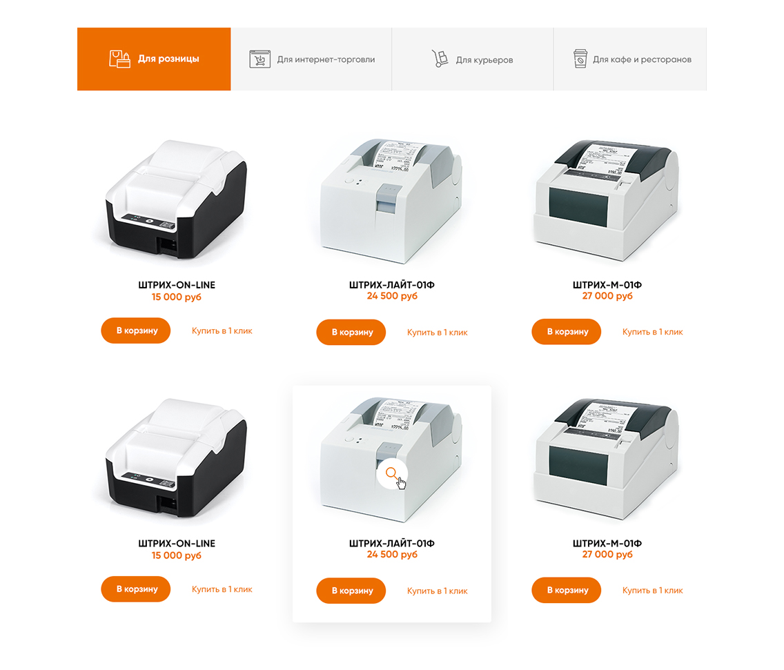
I’ve designed an exhaustive pop-up form that allow the user choose from a variety of POS systems the convenient one. It shows the characteristics and advantages for a specific kind of retail activity.
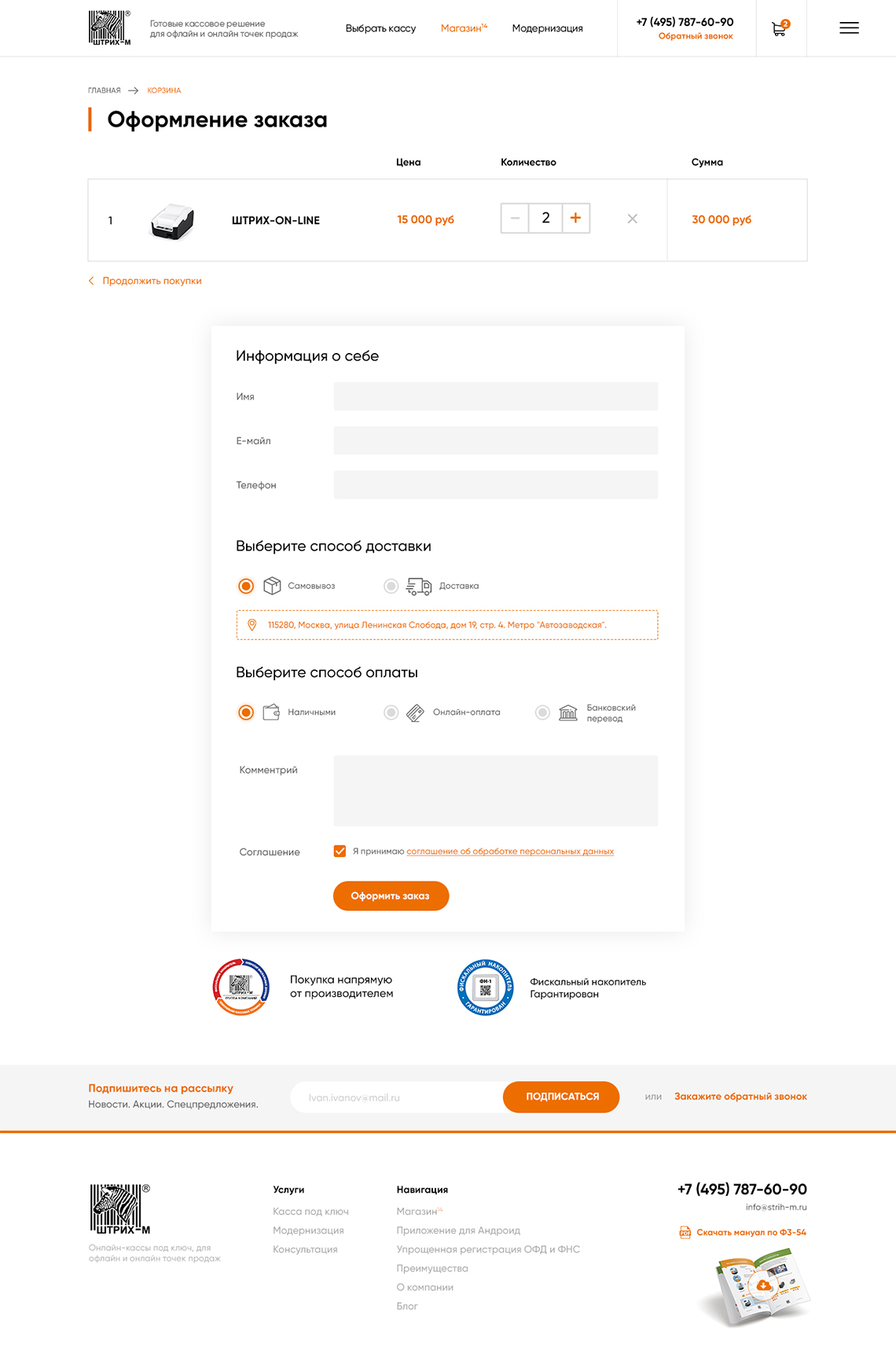
Check-out
Ordering should be simple
Minimum necessary fields to carry out a transaction. We got rid of several steps forms, and used marketing best practices to design the order page.
Working with market leaders is always something special. I got a precise marketing research which describes the implementation of “54-ФЗ” law in small and medium business. This brought a wave of modernisation for the points of sales system from the whole russian retail market. My task was to effectively design an e-shop site aimed to help entrepreneurs renew their old cashiers and other POS systems.
Selected works
I enjoy creating products from concept to release and optimize existing ones so they perform better from both a user and business perspective. My expertise covers the entire digital product design process including brand communication, user experience and user interface design.
For any questions, work or partnership, please feel free to get in touch: work@cojocarumaxim.com
