Site concept
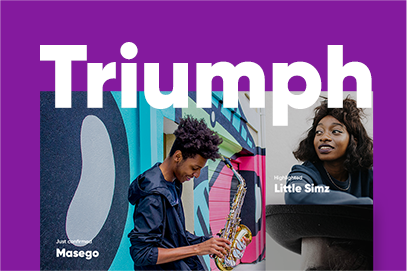
Triumph is a site concept aimed to visualize an open place for creative talents and musicians

Goal
Connect creatives
The task was to design the Triumph’s site club, and represent it as a place that attract youngsters, audiences and artists. Triumph is a venue in the heart of Amsterdam hosting hundred events and connect creatives. It’s more that a stage, Triumph bring together artists’ messages and their audience to create a sustainable and socially responsible culture in the future.

How do actual musical communities use online technology and all its possibilities to provide you, the guest, with a better experience? How do they use it to improve the artists' connection to their audience? Triumph aims to answer these two main questions. I designed this concept to share my vision, so anyone can benefit from this experience.
The core
Highlight the essence
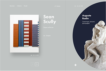
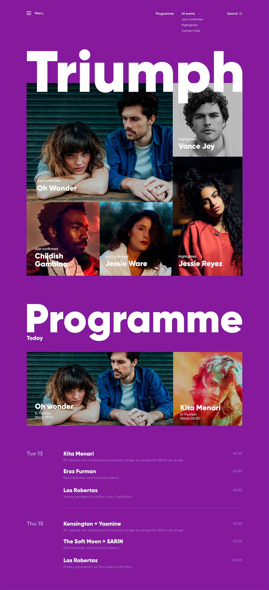
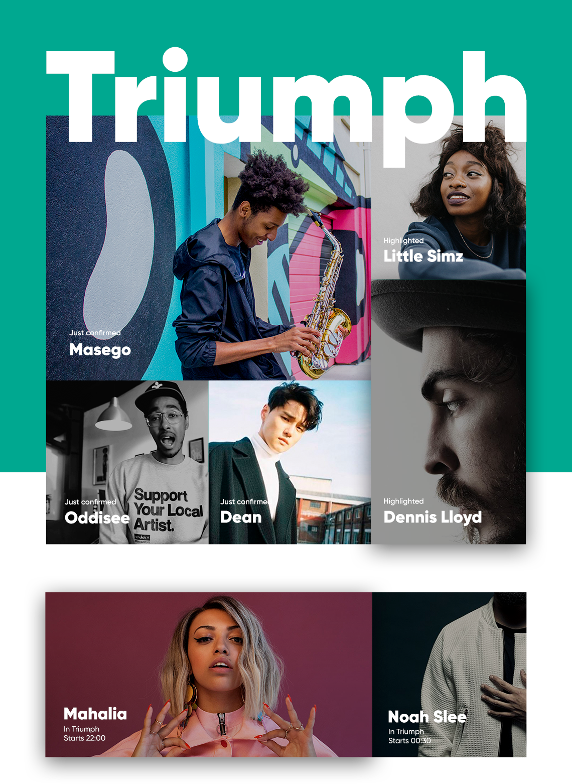
What’s the core thing to view on the site for a youngster like me? Who wants to have a great time and socialize with others? The answers for me was: artists, and upcoming events. This is why the main page has a simple and bold layout that showcase confirmed events, and highlight creative talents.
Yes, that’s so simple. An engaging layout with big images and events name. No more datas and boring disclaimers.
Buy
Simple to buy
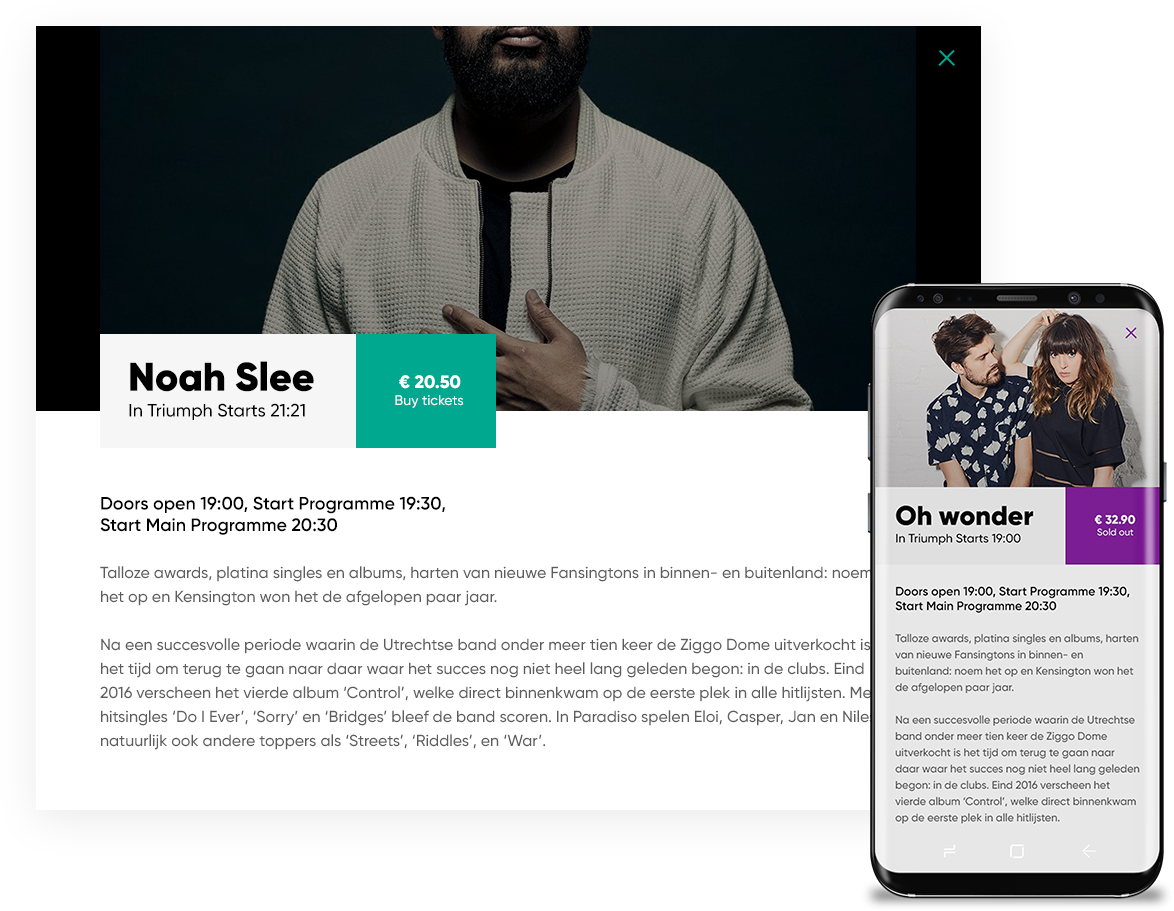
I wonder, why bookings site are so stuffy and have lots of unnecessary information? On Triumph site a single click separates you from having an exciting night experience, or a lonely evening searching instagram and seeing others startling life. This is why I simplified the booking process to a single pop-up window.
The impact
The simpler the greater impact
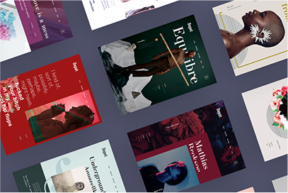
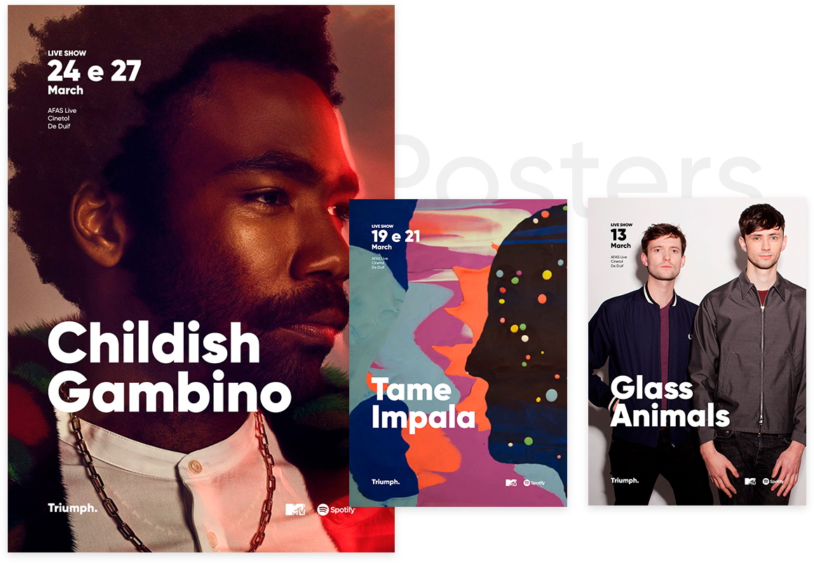
I’ve designed posters mockups in the same bold way. The simpler the greater the impact of artists' messages. With thу fact in mind, you won't be surprised to see almost bare posters with only artists name and few event details. The way I do this is threefold: through exciting images, through titles and through minimum of data
Tickets
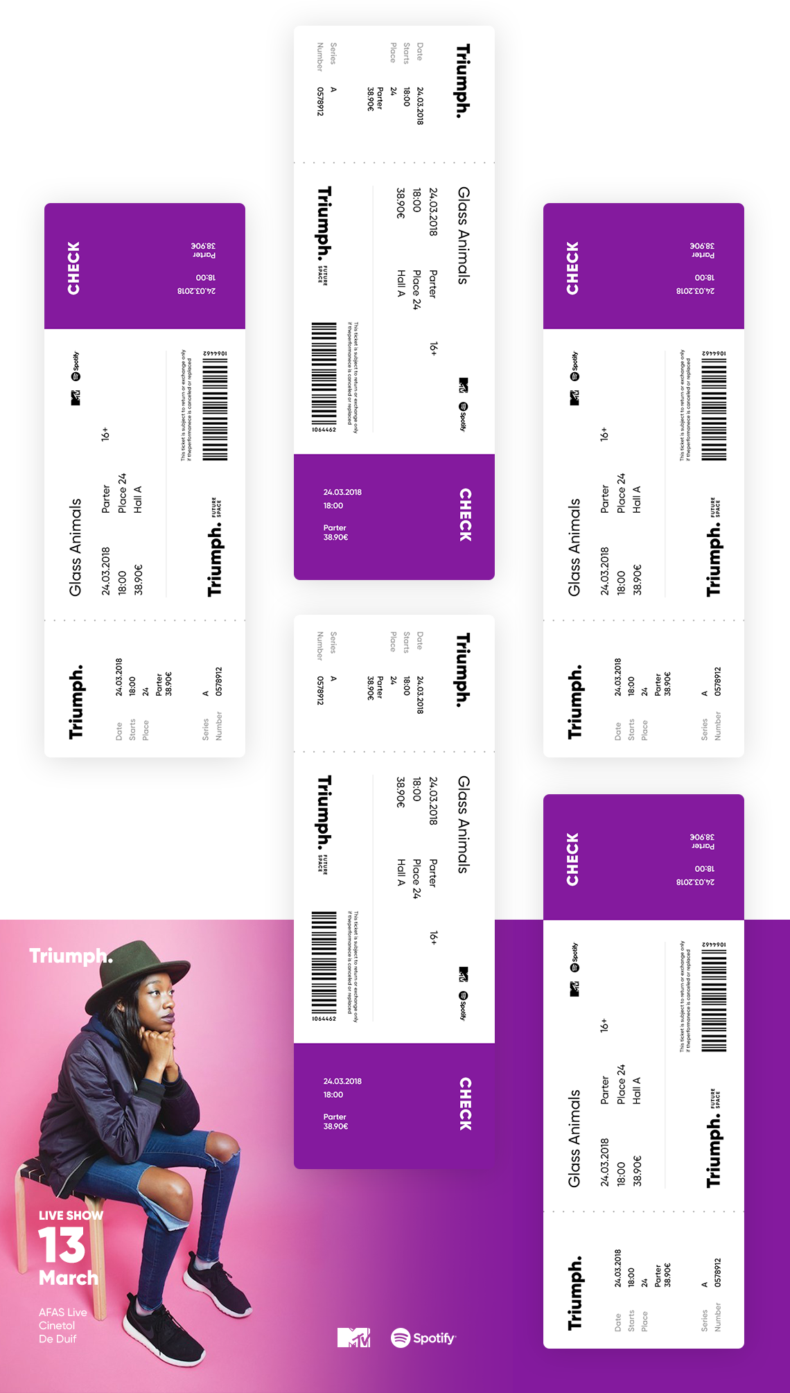
I have a thing for tickets. I constantly get upset receiving them in museums or concerts. They seems clumsy to me and not the thing I want to keep in my wallet. I like the way air companies doe, all the necessary stuff repeated on both sides. Tickets remind you the anticipation you had while waiting for the plane. Concerts tickets should be the same, the piece of paper that get you a thrilling mood.
I was so focused doing this, Triumph aims to inspire and connect youngster in breathtaking experiences. I designed this concept to share my vision of a venue musical place, as a response to the growing social and cultural variety of talented creatives.
Selected works
I enjoy creating products from concept to release and optimize existing ones so they perform better from both a user and business perspective. My expertise covers the entire digital product design process including brand communication, user experience and user interface design.
For any questions, work or partnership, please feel free to get in touch: work@cojocarumaxim.com
